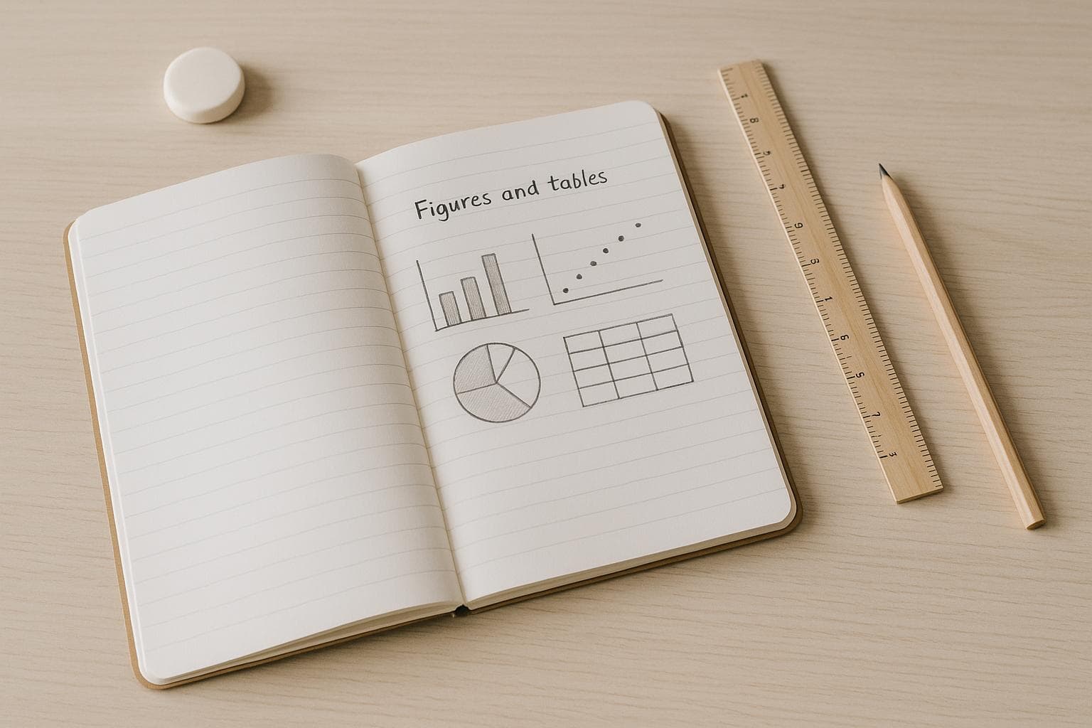
How to Add Figures and Tables to Your Paper Seamlessly
Adding figures and tables to your academic paper can make your data easier to understand and improve how your research is presented. But it’s not just about inserting visuals - it’s about using them effectively to support your argument, follow academic guidelines, and ensure clarity.
Here’s what you need to know:
- Purpose: Use visuals only when they simplify or clarify data better than text. Tables work best for precise numbers, while figures highlight trends or patterns.
- Design: Keep visuals simple, clear, and consistent. Avoid clutter, use readable fonts, and ensure they work in both color and black-and-white.
- Placement: Always refer to visuals in your text before they appear. Place them close to relevant content, with enough spacing to avoid a cluttered look.
- Formatting: Follow style guide rules (e.g., APA, MLA) for numbering, titles, and captions. Ensure titles are descriptive and tables/figures are properly labeled.
- Tools: Use software like Excel for tables and Canva for figures. For advanced formatting, LaTeX offers precise control over layout and integration.
How to add Tables and Figures in academic papers: APA 7th edition
Planning Your Visuals: Picking the Right Figures and Tables
Before jumping into creating visuals, take a moment to plan. Visuals should only be used when they communicate information more effectively than plain text.
Setting the Purpose for Each Visual
Every figure or table you include should serve a clear purpose - either answering a specific question or supporting an argument. Think about the story your data tells and whether a visual can make that story easier to understand.
Tables are ideal for presenting precise numerical data that readers might need to reference or compare. For instance, if you're sharing survey results across different demographic groups or showing statistical analyses with specific values, tables allow readers to focus on exact numbers. A good example would be showing graduation rates over several years - tables make these comparisons straightforward.
Figures, on the other hand, are perfect for highlighting trends and patterns. Line graphs are great for showing trends over time, scatter plots reveal correlations, bar charts compare categories, and pie charts break down parts of a whole.
The trick is aligning your visual with your communication goal. For example:
- To show that sales steadily increased over time, use a line graph.
- To highlight that sales hit exactly $2.3 million in March, a table is the better choice.
Once you’ve set your purpose, it’s time to pick the right visual format for your data.
Picking the Right Format for Your Data
The format of your visual should depend entirely on the type of data you’re working with.
For categorical data, bar charts are usually more effective than pie charts, especially when comparing more than three or four categories. Pie charts can become cluttered and hard to interpret when there are many small slices, while bar charts make comparisons much easier.
When dealing with changes over time, line graphs are typically the best choice. The connecting lines naturally highlight trends and patterns. However, if you’re comparing distinct time periods rather than showing continuous change, grouped bar charts might work better.
For correlation data, scatter plots are your go-to. They clearly show relationships between two variables - whether they move together, in opposite directions, or not at all. Adding a trend line can help make these relationships even more apparent.
If you’re working with hierarchical or process data, flowcharts or organizational charts are more effective than traditional graphs or tables. These formats are designed to show relationships or processes in a way that’s easy to follow.
Whatever format you choose, simplicity is key. Your audience should be able to understand your visual without unnecessary effort.
Creating and Improving Visuals for Clarity
Start by sketching out rough drafts of your visuals. This helps you spot any issues early on. Ask yourself: Does this visual make the data clearer? Can someone grasp the main takeaway in just a few seconds?
Test your drafts with others - colleagues or classmates who aren’t familiar with your research are ideal. If they struggle to understand your visual, it’s time to simplify or reorganize it. A good visual should communicate its message without needing a lengthy explanation.
To guide your audience’s focus, emphasize key data points using size, color, or positioning. For example, highlight the most important trend with a bold color or larger font.
Make sure your visual is legible at its intended size, whether it’s being viewed on a screen or in print. Test it to ensure the details are clear in both formats.
Avoid clutter. Extra grid lines, flashy colors, or 3D effects might seem appealing but often make visuals harder to read. Academic visuals should prioritize clarity over decoration.
Finally, ensure every visual can stand on its own. Add clear titles, labels, and captions so readers understand the context without needing additional explanation.
Formatting Figures and Tables for Academic Standards
In academic writing, precision is key. Well-designed visuals not only make your document look polished but also help establish your credibility. Proper formatting ensures your figures and tables enhance clarity and professionalism throughout your paper.
Numbering and Labeling Your Figures and Tables
Assign numbers to your visuals in a sequential order - one sequence for tables and another for figures. This helps maintain a logical flow and makes it easier for readers to locate specific visuals.
Each visual needs a descriptive title. Place table titles above the table and figure captions below the figure. Follow title case for table headings and sentence case for figure elements, ensuring alignment with your style guide.
Your titles should clearly convey the content of the visual without requiring readers to dive into the text. For example, instead of a vague title like "Table 1: Results", use something more specific, such as "Table 1: Student Performance Scores by Teaching Method and Grade Level." This level of detail immediately communicates the purpose of the visual and aids navigation.
Once your visuals are labeled, the next step is to ensure your tables are easy to read and understand.
Creating Tables That Are Easy to Read
Simplicity is key for table design. Use horizontal lines sparingly - typically one below the column headers and another at the table's bottom. Avoid vertical lines; instead, rely on white space to separate columns and rows, giving your table a clean, uncluttered look.
Make column headers concise and clear. If additional context or explanations are necessary, include them as notes below the table rather than cramming too much information into the headers. For instance, instead of writing "Average Test Scores (out of 100 points, administered in May 2024)" as a header, simplify it to "Average Test Scores" and provide the details in a footnote.
Align text and numbers thoughtfully - right-align numerical data or align on decimal points, while keeping text left-aligned. Maintain consistent decimal places and use a standard currency format (e.g., $1,234.56) throughout your tables.
Consider the table's dimensions. A table that’s too wide for the page can disrupt formatting and make it harder for readers to follow. If your table becomes unwieldy, break it into smaller sections or rotate it to a landscape layout. Always prioritize readability.
Once your tables are in order, focus on creating figures that are visually consistent.
Making Figures Look Consistent
Consistency is crucial when designing figures. Stick to a single font family and uniform font sizes for similar elements across all visuals.
Use a consistent color scheme throughout your paper. If a specific color represents a category in one figure, use the same color for that category in every subsequent figure. For example, if blue represents the "control group" in one chart, it should always represent the control group. This approach helps readers grasp the visuals quickly without repeatedly checking the legend.
Size your figures appropriately based on complexity. A straightforward bar chart with three categories doesn’t need to dominate the page, while a detailed scatter plot with multiple variables might require more space to remain legible. Ensure all visuals are clear and readable in both digital and print formats.
Maintain uniform axis formatting across similar charts. Use consistent scales when comparing related datasets and apply the same date formats and interval spacing for time-based data. This uniformity makes comparisons intuitive and straightforward.
Ensure figures are effective in black and white. Even if your paper is submitted digitally, it may be printed or viewed on devices with limited color capabilities. Use line styles (solid, dashed, dotted) or patterns, in addition to colors, to distinguish between data series. This not only ensures accessibility for readers with color vision differences but also guarantees clarity in all formats.
Where to Place Figures and Tables in Your Paper
Placing visuals thoughtfully keeps readers engaged and strengthens your argument.
Matching Visuals with Text References
Once you've planned your visuals, their placement plays a big role in improving clarity. Always refer to a figure or table in your text before it appears. For instance, when you mention "Table 2" or "Figure 3", readers should find it nearby - ideally on the same page or the next. This avoids unnecessary page-flipping, which can disrupt the reader's focus and weaken your paper's impact.
Weave visual references naturally into your sentences. Instead of saying, "Table 1 shows the results", you could write, "Student performance improved significantly across all grade levels (Table 1)." This approach keeps your writing fluid while guiding readers to the relevant visual.
Spacing and Page Layout Tips
Leave enough white space around visuals. A cluttered layout not only looks unprofessional but also makes reading harder. Ensure there's at least one blank line before and after each figure or table to give your visuals room to breathe.
Avoid splitting tables across pages. If a table doesn’t fit on the current page, move the entire table to the next one. Splitting tables forces readers to piece together information, which can be confusing. For very long tables, break them into smaller sections with clear subheadings.
Keep figures legible and intact. Resize them to fit within a single page without making them too small or overly dominant. This ensures clarity while keeping your layout balanced.
Center visuals with consistent margins and spacing. This uniformity not only looks polished but also makes your paper easier to navigate.
Use page breaks wisely. If a visual ends up at the bottom of a page with only a few lines of text above it, move it to the top of the next page. This adjustment avoids awkward spacing and improves the overall flow.
Thoughtful spacing not only enhances readability but also helps group related visuals effectively.
When to Group Visuals Together
Sometimes, grouping visuals can make your paper more organized. Place supplementary visuals in an appendix unless they’re critical to your argument. For instance, detailed charts, extended data tables, or extra examples are better suited for appendices. This keeps your main text concise while still offering additional details for readers who want them.
Use appendices for large datasets or numerous related visuals. If you have 10 or more tables showing similar data, group them in an appendix to prevent clutter in your main text. For example, if your research involves survey responses across various demographics, you might include summary data in the main text and place detailed breakdowns in Appendix A.
Provide clear cross-references for appendices. Instead of vague mentions, write specifics like "detailed demographic data can be found in Appendix B, Tables B1-B5." This precision helps readers quickly locate the information and understand how it supports your main argument.
Organize visuals by theme or methodology. For instance, if your paper includes both survey data and interview results, group all survey-related visuals in Appendix A and interview-related charts in Appendix B. This structure helps readers follow your research approach and find relevant details easily.
Keep essential visuals in the main text. Reserve appendices for supplementary material. Any figure or table that directly supports a key argument should stay in the main body, placed close to the relevant discussion for maximum impact.
sbb-itb-1831901
Tools for Creating and Editing Visuals
The right tools can turn raw data into polished visuals that enhance your academic work. Whether you're working with straightforward tables or complex figures, picking the right software can save you time and effort while ensuring your visuals look professional.
Using Spreadsheet Software for Tables
Microsoft Excel and Google Sheets are excellent for creating clean, organized tables. These tools are user-friendly and allow you to format data consistently while exporting tables directly into your documents. Excel stands out for its advanced formatting features, while Google Sheets is ideal for real-time collaboration with research teams.
Excel’s built-in table styles simplify formatting. By clicking the "Insert" tab and selecting "Table", you can instantly apply borders, alternating row colors, and headers to your data. This ensures your tables meet academic standards with minimal effort.
Google Sheets is perfect for group projects. Its real-time editing and revision history are invaluable during peer reviews, allowing you to track changes and revert to earlier versions if necessary.
Exporting tables as images preserves formatting. This prevents layout issues that often arise when copying raw data into Word documents or LaTeX files.
Highlight key data with conditional formatting. Excel’s conditional formatting feature can automatically color-code cells based on their values, making trends or outliers easy to spot. For example, you could highlight values above the 90th percentile in green to emphasize significant results.
When it comes to figures, specialized graphic tools can take your visuals to the next level.
Creating Figures with Graphic Tools
Canva is a versatile option for creating academic figures. Its intuitive drag-and-drop interface makes it accessible even for those without design experience, while still delivering professional-quality visuals.
Start with Canva’s "Research Poster" or "Infographic" templates. These templates are designed for clarity and readability, providing a solid foundation you can customize with your own fonts, colors, and layouts.
Add annotations to enhance understanding. Canva makes it easy to include labels, arrows, and callout boxes to clarify complex figures. This is especially useful for annotating charts from statistical software or emphasizing specific areas in diagrams.
Ensure visual consistency across your work. Canva allows you to create and save custom color palettes, which is helpful for aligning your visuals with your institution’s branding or journal guidelines.
Export your figures in multiple formats. Canva supports PNG for general use, PDF for high-quality prints, and SVG for scalable graphics. This flexibility ensures your visuals look sharp whether they’re viewed digitally or in print.
By using these tools, you can create visuals that are both visually appealing and academically rigorous.
Advanced Formatting with LaTeX

For those needing detailed control over layout and formatting, LaTeX offers unparalleled precision. While it has a steeper learning curve, LaTeX ensures your figures and tables integrate seamlessly into your document.
Use \begin{table} and \begin{figure} for automatic numbering and placement. LaTeX handles cross-references automatically, so if you add or remove tables, the numbering updates throughout your document. This eliminates errors in long papers.
The \includegraphics command allows precise figure integration. You can control dimensions and positioning with commands like \includegraphics[width=0.8\textwidth]{figure1.png}, which scales your figure to 80% of the text width while maintaining proportions.
Enhance table formatting with the booktabs package. This package creates clean, professional tables with proper spacing and horizontal lines, meeting academic publishing standards without manual adjustments.
Gain control over figure placement with the float package. By using the [H] option, you can ensure visuals appear exactly where you want them in your document, which is crucial for maintaining logical flow.
Save templates for consistency. Once you’ve perfected a table or figure style in LaTeX, save it as a reusable template. This ensures all visuals in your paper maintain a uniform appearance, adding a polished touch to your work.
Mastering these tools allows you to create visuals that not only look great but also meet the rigorous standards of academic publishing.
Following Citation and Style Guide Rules
Adhering to citation and style guide rules is crucial for maintaining academic credibility. Beyond ensuring your visuals are visually clear and well-placed, proper citation and formatting reinforce their integrity. This means following the specific requirements for attribution, numbering, and presentation as outlined by your chosen style guide.
How to Cite Figures and Tables in Your Text
Always refer to visuals directly in your text. This helps readers follow your argument and understand the relevance of each visual. Use phrases like "As shown in Table 1" or "Figure 2 illustrates" to naturally integrate visuals into your narrative.
Number visuals sequentially. Figures and tables should be numbered separately and in the order they appear (e.g., Figure 1, Figure 2, Table 1, Table 2). This ensures clarity and consistency throughout your document.
APA style has specific citation requirements. You can reference visuals with parenthetical citations (e.g., "see Figure 1") or by weaving the citation into your sentence. If a visual is adapted from another source, include proper attribution with the original author’s name and publication year.
MLA style uses different conventions. Visuals are typically cited using lowercase abbreviations in parentheses (e.g., "(fig. 1)" or "(table 2)"). When discussing visuals in your text, you can use capitalized labels like "Figure 1 shows…" for clarity.
These practices help integrate visuals seamlessly into your writing while maintaining proper attribution.
Formatting Visuals to Meet Style Guide Rules
APA guidelines specify distinct placements for captions and titles. For figures, captions go below the visual in italics with a brief description. For tables, titles appear above in bold, followed by any necessary notes below.
Spacing matters. APA requires double-spacing for captions and titles but allows single-spacing within table cells. Always check your style guide for exact spacing requirements.
Keep font formatting consistent. Figures and tables should use the same font as your main text - commonly 12-point Times New Roman in APA style. Avoid decorative fonts, as they can distract from your data.
Include source information directly under visuals. In APA, this is done with a note (e.g., "Note. Adapted from [source]"). For MLA, full citations go on the Works Cited page, with a parenthetical citation near the visual.
Ensure visuals are appropriately sized and aligned. They should fit within standard 1-inch margins and be centered unless your style guide states otherwise. Proper sizing ensures all details are clear without overwhelming the page.
Place citations immediately after the visual to maintain clarity and support the integrity of your academic work.
Adding Footnotes and Abbreviations
Use footnotes for defining technical terms or abbreviations in tables. Add superscript letters (a, b, c) after terms needing clarification, and provide definitions below the table. This keeps the table clean while ensuring readers can easily understand the content.
Explain statistical significance markers. If your tables use symbols like asterisks to indicate p-values or confidence levels, define these in a note below the table (e.g., "Note. *p < .05, **p < .01, ***p < .001").
Introduce abbreviations in figure captions. Spell out the full term followed by the abbreviation in parentheses the first time it’s mentioned (e.g., "Gross Domestic Product (GDP)"). For subsequent uses, the abbreviation alone is sufficient.
Use alphabetical superscripts for general notes and numerical superscripts for source citations. This distinction keeps notes and citations organized and easy to follow.
Provide a general note for broader context when needed. If multiple elements in a table require explanation, a single overarching note can clarify everything without cluttering the table itself.
Conclusion: Simplifying Visual Integration for Academic Papers
Incorporating figures and tables into your academic papers doesn’t have to be complicated. It starts with careful planning - deciding which data truly benefits from a visual representation and selecting the format that communicates most effectively to your audience. When every visual element has a clear purpose, the process becomes much more straightforward.
Consistency and proper formatting play a big role in making your work stand out. By adhering to your style guide’s requirements, you ensure that visuals enhance, rather than detract from, your research. Well-structured and consistent visuals also help establish your credibility with readers.
With practice, the technical details - like creating clean tables in spreadsheet software or positioning visuals effectively within your text - become second nature. Thoughtful placement of visuals helps guide your audience through your research seamlessly.
Don’t overlook the importance of proper citation and attribution. Acknowledging the sources of your data or adapted concepts safeguards your academic integrity and honors the contributions of others.
To make the process even smoother, tools like Yomu AI can simplify the technical aspects of writing. Features such as autocomplete, citation formatting, and plagiarism checks allow you to focus on refining your research and perfecting your paper.
Mastering visual integration does more than just improve the appearance of your paper - it enhances your academic reputation. Well-designed visuals tell your research story more effectively and showcase your attention to detail. Over time, this skill becomes an asset that strengthens both the clarity of your work and its overall impact.
FAQs
When should I use a table versus a figure to present data in my paper?
When presenting detailed data or comparing multiple variables side by side, tables are your go-to choice. They excel at displaying precise values and complex datasets in an organized and straightforward manner.
Meanwhile, figures - like graphs, charts, or illustrations - shine when it comes to highlighting trends, patterns, or relationships. They allow readers to quickly understand key takeaways and often create a more visually engaging experience. Always think about your audience and the goal of your presentation to determine whether a table or a figure is the most effective option.
What mistakes should I avoid when adding figures and tables to my paper?
When adding figures and tables to your paper, it's important to sidestep a few common mistakes that can detract from your work's impact:
- Unclear visuals: Make sure every chart or table communicates a precise message that aligns with your research goals. Ambiguity can confuse readers.
- Using the wrong format: Choose the type of chart or table that best represents your data. For instance, bar charts are great for comparisons, while line graphs work well for trends.
- Overloading with information: Simplify. Focus on the key data points rather than cramming too much into a single visual.
- Inconsistent design: Stick to the same fonts, colors, and formatting across all visuals to maintain a polished and cohesive look.
- Poor color selection: Opt for accessible and easily distinguishable colors. Avoid combinations that are too bright or clash, as they can distract or make your visuals hard to read.
- Weak captions: Write captions that stand alone. A reader should understand the figure or table without needing to hunt for additional context.
By avoiding these pitfalls, your visuals can become powerful tools that enhance the clarity and professionalism of your paper.
How do I make sure my figures and tables follow APA or MLA guidelines?
When preparing figures and tables for your paper, make sure to label and number them in the order they appear. Each one should include a clear title, a number, and, if needed, source details for any cited data. For APA, captions are typically placed below figures and above tables. In contrast, MLA requires captions directly below both figures and tables.
It's important to carefully review your formatting against the style guide you're following. Check for details like font size, spacing, and citation format to ensure everything aligns. These small touches can make your work look polished and professional.